Who is the man in the Cracker Barrel Logo? History of iconic branding explored as major boycott row erupts over design change
-
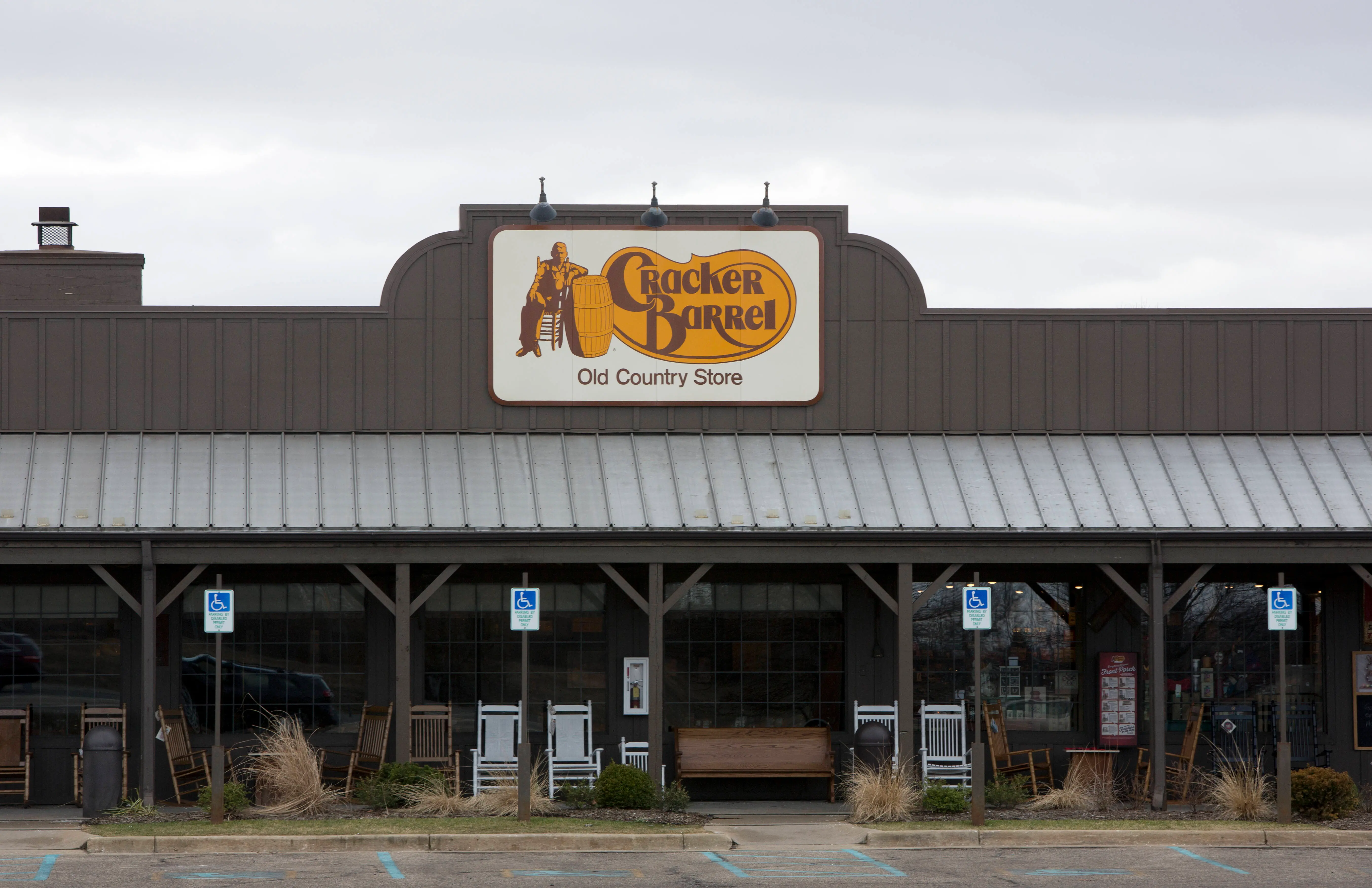 A Cracker Barrel restaurant (Photo by Tasos Katopodis/Getty Images)
Restaurant chain Cracker Barrel landed itself in the hot pot after a recent logo redesign. It all began on Wednesday, August 20, 2025, when conservative commentator Benny Johnson took to his X to share a post calling out the change.
Noting that it was the first time in 47 years that the food chair changed its "iconic logo," he called it "absolutely horrible." The post went viral with over 3.5 million views and over 11,000 comments.
Cracker Barrel completely changed their iconic logo for the first time in 47 years...
— Benny Johnson (@bennyjohnson) August 20, 2025
and it's absolutely horrible.
When will they learn? pic.twitter.com/ZhfVeR5CyOThe brand's original logo featured a man sitting with his legs crossed on a chair, leaning against a barrel. Speculations suggest the man is the franchise's founder, Dan Evins' uncle, Herschel, according to Logopedia. It was designed by Bill Holley in 1977. However, per a report by Chowhound, the man, nicknamed "Old Timer," was an old man in overalls signifying Dan's image of "rustic nostalgia."
Starting in 2024, the brand began its redesign campaign, which included phasing out the man and keeping just the text. The recent design is a more streamlined version of the 2024 logo.
As news of the development spread, internet users were quick to react.
"Now why would they remove the cracker & the barrel?" one questioned.
"Will you go to Cracker Barrel now that it's going woke? This could be a "Bud Light" moment in the making..." another commented.
"Yes let’s remove everything charming and distinct from the logo and make it as generic and boring as we possibly can," a user wrote.
Here are some more comments seen on X:
"My Prediction is that Cracker Barrel’s stock will almost immediately tank and the CEO will be fired," one remarked.
"Boycott Cracker Barrel until they reinstate the old cracker and his barrel," another reacted.
"Cracker Barrel’s old vs. new logo Should this qualify as a War crime???" a person wrote.
Cracker Barrel revamped its logo and aesthetics starting in 2024 as part of its All the More campaign
Dan Evins founded Cracker Barrel Old Country Store in September 1969. At the time, they didn't have any official logo, and its signage simply spelled its name in a yellow western-style font over a brown emblem. In April 1977, the brand expanded to 13 locations, per Logopedia. They also designed its logo with the aid of Bill Holley.
According to Chowhound, speculations suggest the man in the logo is Dan's Uncle Hershel, who was the brand's goodwill ambassador. However, the outlet claims it wasn't the case and the design evolved from a napkin sketch.
Per Chowhound, Evins wanted something that could be best described as "rustic nostalgia," recalling a memory of an old man in overalls sitting on the porch.
Holley's original design featured a man sitting on a chair with his legs crossed as he rested his arm atop a barrel. It had a light yellow background with brown embellishments. The font included swooping "k," "r," and "b" encompassing the name.
In 2006, the franchise modernized its logo, making it bolder with sharper contrast. Old Timer's look was also enhanced to make it more relatable. Notably, starting in 2015, the "R" in its name was changed from uppercase to lowercase, and Old Timer was also made taller.
However, between 2015 and 2021, the company and its logo received backlash after viral claims suggested the name "cracker" and the swooping line represented a slave whip. In 2021, Cracker Barrel refuted the claims, according to Chowhound. Citing the franchise, the outlet wrote:
"The part of the logo being referenced is a flourish, which is used in the calligraphy of the logos of many brands."
In 2024, the food company began phasing out Old Timer and only keeping its name. According to The Takeout, in its most recent design, its name is placed on a yellow backdrop seemingly shaped like a barrel. The font, too, was modernized.
The aesthetic design was part of its All the More campaign, started in an effort to boost sales. It also included upgrading its store interiors and lighting.
Per the outlet, the move seemed to be successful, with Cracker Barrel seeing improvement in sales.
TOPICS: Cracker Barrel