What's With All the Black Bars on TV Shows These Days?
-
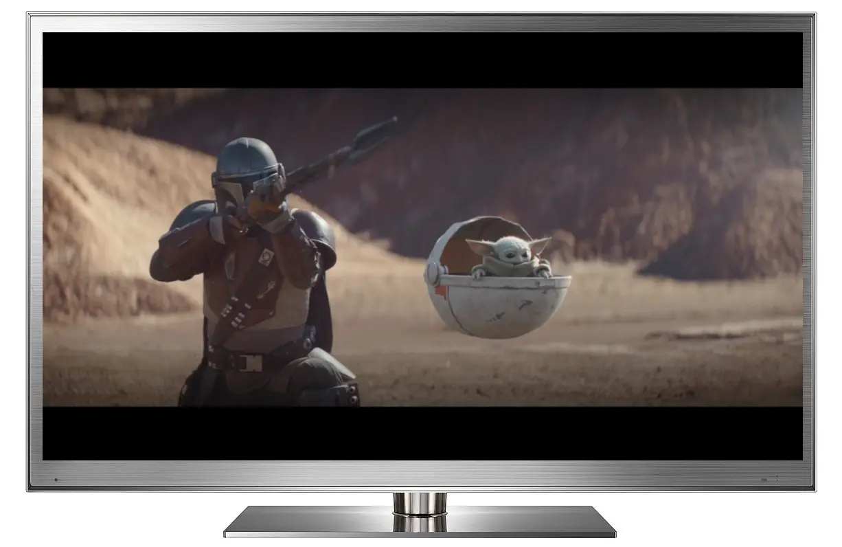 Star Wars: The Mandalorian letterboxed on an HDTV screen.
In times past, most viewers took it for granted that any video content they watched on their TVs would fill the entire screen with image. The rise of the DVD format in the late 1990s started to educate people about how theatrical movies often came in different shapes that required letterboxing to preserve their Original Aspect Ratios, and the transition from standard definition to HDTV moved everyone away from the boxy 4:3 TVs of old to a wider standard. Nevertheless, until recently, almost all TV shows and made-for-TV movies were photographed with the intention of fitting perfectly onto a television screen, filling the edges from top to bottom and side to side. That's no longer the case.
In the Peak TV era, many content creators have experimented with ways to make their television shows look and feel more cinematic, like theatrical feature films. One that's caught on in a big way is the decision to break free from the confines of a standard TV shape. The trend of making television shows wider than the usual 16:9 aspect ratio first started on streaming platforms, but soon snuck into cable programming and has even recently crept into shows on major broadcast networks.
Why is this happening? Is there a genuine purpose behind it or is it just a pretentious fad? Addressing those questions will require a look back at the reasons why movies and TV shows don't have just one standard shape.
A Quick History of Aspect Ratios in Movies
When motion picture photography was invented in the late 1800s, the first examples had a roughly squarish shape. During the silent film era, the exact ratio of any particular movie might vary depending upon the camera process or projector type used, but they mostly fell into a range of approximately 1.20:1 to about 1.33:1. The advent of the talkies brought the first major push for standardization around a ratio of 1.37:1, known as the Academy Ratio, which persisted as the dominant format through most of Hollywood's Golden Age. Countless classic films such as Gone with the Wind, It's a Wonderful Life, and Casablanca were photographed in this ratio.
The first televisions followed the lead set by theatrical features and adopted a very similar screen shape of 1.33:1. Although that was technically a silent film ratio, it was close enough that hardly anyone noticed the difference, much less complained about it. Those old TVs had upwards of 30% overscan obscuring the edges of the frame anyway. As far as most people were concerned, the main difference between movies and TV was screen size, not shape.
By the 1950s, the popularity of television had cut into box office revenue enough that Hollywood grew concerned and the studios began developing new film formats intended to showcase theatrical features as a superior medium delivering an experience that couldn't be had at home. One of the most popular of these was CinemaScope, developed by 20th Century Fox, which used anamorphic lenses to expand the photographic image size to nearly twice the width of traditional Academy Ratio. When projected as intended, with the screen the same height as an Academy Ratio movie but now much wider, CinemaScope provided a huge, immersive picture that enveloped a viewer's peripheral vision. This was sensationally popular with audiences and ticket sales soared.
The first CinemaScope movies had a ratio of 2.55:1. The introduction of stereo sound a few years later reduced that slightly to 2.35:1. The success of CinemaScope begat a host of imitators and competitors, some with their own proprietary aspect ratios, including VistaVision (1.66:1), ToddAO 65mm (2.20:1), Cinerama (2.89:1 with a 146º curve), and more. Most of those eventually faded away, until the industry settled on a dual theatrical standard. Movies photographed with spherical (or "flat") lenses would be projected at 1.85:1, while CinemaScope movies would be projected at 2.35:1. By 1960, the old Academy Ratio had all but disappeared. Within another decade, even CinemaScope was superseded by competitor Panavision, which implemented very similar, yet technically superior anamorphic lenses.
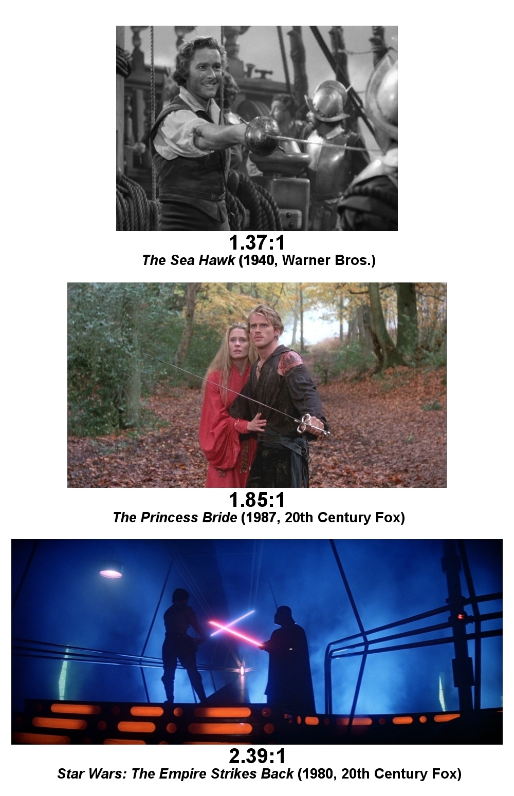
In 1970, Panavision amended its aspect ratio to 2.39:1 to correct an issue with inadvertent flashing at the top of the frame, and that became the new "scope" standard that persists to this day. Nevertheless, many people in the industry continue to refer to it as "2.35:1" out of habit, while others round it to 2.40:1. As mathematically illogical as it may be, all three numbers – 2.35:1, 2.39:1, and 2.40:1 – actually refer to the same thing and are often used interchangeably.
The dual 1.85:1 / 2.39:1 standards have served Hollywood well for decades and continue to dominate filmmaking today. Looking at movies released in 2019, a couple of the biggest box office hits were Joker (1.85:1) and Toy Story 4 (2.39:1). But filmmakers are creative people who like to experiment. In 2008, director Christopher Nolan decided to shake things up by photographing some scenes in his blockbuster The Dark Knight with extra-large IMAX film stock. This resulted in the movie varying its aspect ratio from scene to scene between 2.39:1 and a taller 1.44:1 when projected in IMAX theaters. (The regular 35mm theatrical prints were cropped to a constant 2.39:1 in all other theaters, and the movie's photography was composed to be safe for that.) Since that time, a couple dozen other movies have similarly played with variable aspect ratios, but they remain a minority among the hundreds of films produced every year.
The Birth of Black Bars on the Small Screen
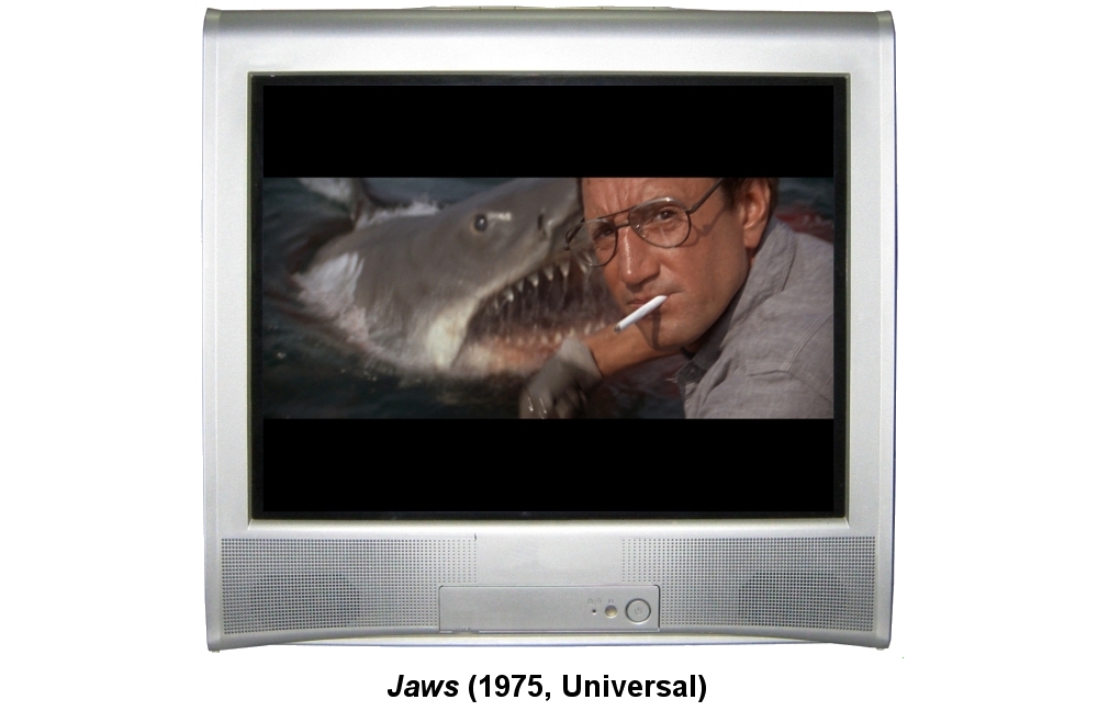
The concept of "letterboxing" a video image first appeared in 1984 with the release of Federico Fellini's Oscar-nominated Amarcord on the short-lived RCA SelectaVision (a.k.a. CED) home video format. For the first time ever, a widescreen theatrical film could be watched in close to its Original Aspect Ratio on a TV by adding black bars above and below the movie image to fill the excess height of the screen. Woody Allen's Manhattan followed several months later with a letterboxed edition on Laserdisc. According to legend (perhaps apocryphal), viewers were so confused by this that they returned countless copies of both movies to retailers, complaining that the discs were "defective" for blocking out parts of the screen.
Letterboxing took a while to catch on, but by the mid-1990s the process was firmly established as the accepted standard on Laserdisc, which had become the home video format of choice for discerning film lovers and videophiles at that time. Even so, the Laserdisc collecting community was a small niche among the general populace, and most viewers still watched movies cropped to fill their TV screens when broadcast on television or released on VHS. That finally started to change with the debut of the DVD format at the end of the decade. Most of the major home video studios supported the practice of letterboxing on DVD from its inception. The format's tremendous popularity and explosive growth made a huge impact in educating viewers about the importance of a movie's Original Aspect Ratio.
However, letterboxing was always a compromise. Preserving a movie's original composition and image shape came at the cost of shrinking it down to a smaller size on a TV screen. CinemaScope and Panavision films, which were designed to be large and immersive in the cinema environment, were now the smallest content when viewed at home. Big budget, epic movies were unavoidably diminished when watched on a screen where they were smaller than soap operas, game shows, and sitcoms.
What Does Any of This Have to Do with TV Shows?
Through all the evolution in the cinema landscape, the television medium largely remained unaffected. Even while theaters rushed to build wider CinemaScope auditoriums and screens in the 1950s, TVs continued to be manufactured in the same 1.33:1 (a.k.a. 4:3) screen aspect ratio they always had been, and TV shows continued to be photographed and broadcast to match that ratio. It would take several more decades before anyone pushed to change that.
Around the turn of the new century, television manufacturers and broadcasters finally made a major upgrade, away from the old NTSC and PAL standard definition formats up to the much better quality of high definition video. With this also came a change in screen ratio, from 4:3 to a new widescreen shape of 16:9 (1.78:1). That number was chosen as a mid-way point between the presumed narrowest content likely to be watched on the TV (4:3) and the widest (2.39:1), such that either of them would have approximately the same amount of black bars when letterboxed or pillarboxed on the screen. While not an exact match for any theatrical aspect ratio, 16:9 is very close to 1.85:1. This greatly helped to counteract the problems with shrunken image size on widescreen movies, though 2.39:1 scope films still remained the smallest content on the screen, in direct opposition to the artistic intent of that format.
Television series creators quickly moved to photograph their shows in the new 16:9 aspect ratio. For a number of years, it was common for networks to broadcast many shows in both the 4:3 (for the standard definition feed) and 16:9 (for HD) formats simultaneously. Over time, that practice diminished and everything settled into 16:9.
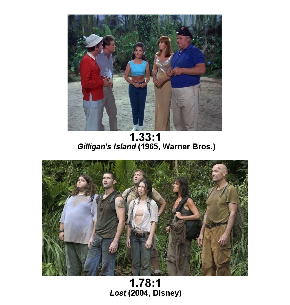
For another decade or so, that's where things sat. Movies in theaters might be projected at either 1.85:1 or 2.39:1, while just about everything made for television was composed for and broadcast at a fixed, TV-filling ratio of 16:9.
The New Normal
The rise of Netflix and the video streaming revolution disrupted the television and broadcast industry in a number of ways. In its bid to compete with traditional television networks, Netflix developed and streamed its first original series, the political drama House of Cards, starting in 2013. Hoping to differentiate it from other TV shows, executive producer David Fincher (the filmmaker behind Fight Club and The Social Network, among others) composed and shot the pilot episode with an unusual aspect ratio of 2:1. This made it wider than 16:9 but not quite as wide as 2.39:1. The pilot and all subsequent episodes streamed on Netflix with letterbox bars as part of the image. If not the very first TV series to do this, it was the first to gain widespread mainstream exposure.
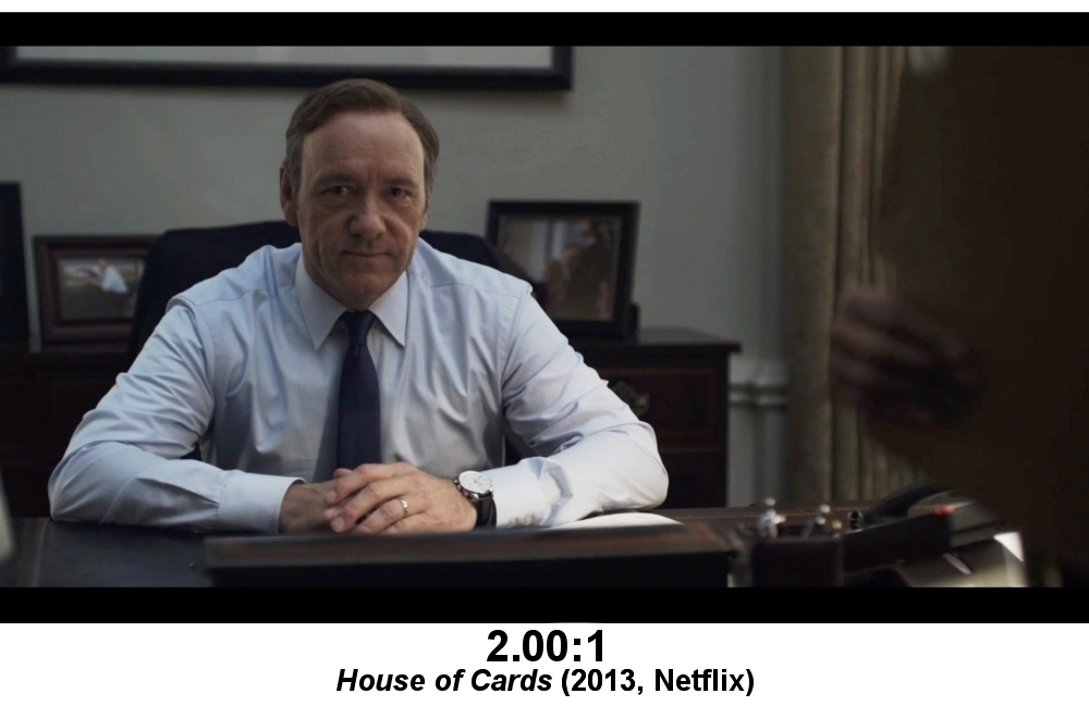
The choice of 2:1 as the ratio served a dual purpose of making the series feel more grandiose and cinematic than typical broadcast fare while also, ironically, being a pretty good fit for small smartphone and tablet screens, which are usually a little wider than 16:9 and are an important viewing venue for Netflix's distribution model.
Although Netflix did not enforce 2:1 as a mandatory standard for all of its original programming (Orange Is the New Black, for example, has conventional 16:9 composition), the ratio quickly gained traction and proliferated both on that platform and on competing streaming services. Other examples include Netflix's current flagship series, Stranger Things, as well as Amazon's Transparent, CBS All Access' The Good Fight, and Hulu's The Handmaid's Tale (starting with Season 2).
As the Peak TV movement grew, more feature filmmakers were lured into the realm of television, drawn by the allure of long-form storytelling and/or the promise of steadier paychecks. Many of them brought along artistic ideas that might have previously been considered unconventional for the small-screen. If viewers, for the most part, seemed to be fine with watching TV shows letterboxed to 2:1, would they object to even wider formats? The success of Netflix's Master of None and Amazon's Fleabag proved that even the scope 2.39:1 ratio was no longer off limits for an ongoing television series.
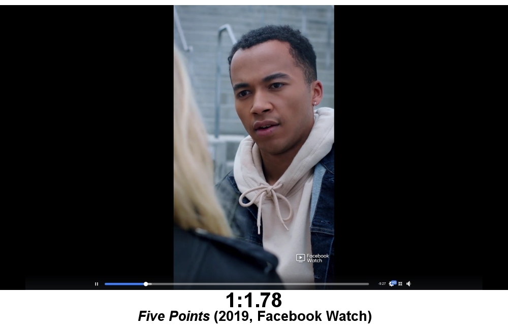
Over the next few years, the floodgates opened for experimentation with aspect ratios, to the point where there's little sense of a standard anymore. A TV series can be almost any ratio its creators feel like, whether it be wider or narrower than a television screen. While some have stuck with cinema ratios like 1.85:1 (Too Old to Die Young on Amazon), others have chosen seemingly random numbers like 2.10:1 (The Spy on Netflix) or 2.20:1 (Doom Patrol on DC Universe). Still more play around with variable aspect ratios like Amazon's Homecoming, which has some scenes in a very narrow 1:1 while others are 16:9 or 2.39:1. Facebook Watch made the bold decision to reformat its teen drama Five Points from 16:9 (1.78:1) in Season 1 to portrait layout 1:1.78 in Season 2.
Eventually, the trend spread from streaming to cable, and letterboxing appeared on shows such as FX's Fargo (2:1 starting season 3), Showtime's Escape from Dannemora (2.39:1), and USA's Treadstone (1.95:1). Even HBO, once notorious for having a firm "No Black Bars Ever" policy, relented and has aired original series, miniseries, and specials at ratios from 2:1 (Chernobyl) to 2.39:1 (Leaving Neverland). Its Westworld regularly jumps from 16:9 to 2.39:1, scene-to-scene.
Broadcast networks have been the slowest to change, but The CW has a handful of series including Batwoman and Nancy Drew at 2:1 now. This season, Fox joined the wave with Prodigal Son (also 2:1). Will it be much longer before we regularly see letterboxing on the old stalwarts ABC, NBC, or CBS?
The Long and the Short of It
Amid all this newfound unrestricted freedom of composition, an important point seems to have been lost. The original intent of widescreen cinema was to display a photographic image larger than narrower aspect ratios. As designed, a CinemaScope 2.35:1 film was meant to be projected at the same height as other movies, but much wider, filling the viewer's horizontal peripheral vision. Unfortunately, television simply doesn't work that way.
Aside from the tiny niche of home theater enthusiasts who have installed 2.35:1 or wider projection screens for Constant Image Height display, the vast majority of other viewers will watch all television shows on HDTV screens with a fixed 16:9 aspect ratio. Any content wider than that shape will be reduced in size. While we may have accepted this as a necessary compromise for watching theatrical feature films at home, one has to wonder if it really serves the needs of programming created specifically for television.
In some cases, it definitely does. The wide 2.39:1 very much suits The Mandalorian on Disney+, which is obviously photographed for consistency with the Star Wars movie franchise it spun off from. Likewise, the scope framing helps Netflix's Godless feel like a classic Hollywood western. Some shows use the aspect ratio for creative narrative purpose. For instance, the multiple screen ratios in Homecoming denote different time periods in the story, and the second season of The OA on Netflix does something similar with storylines that take place in alternate universes. Other times, a show may simply have a very artistic sense of composition that benefits from a wider ratio, even at the expense of lesser image size.
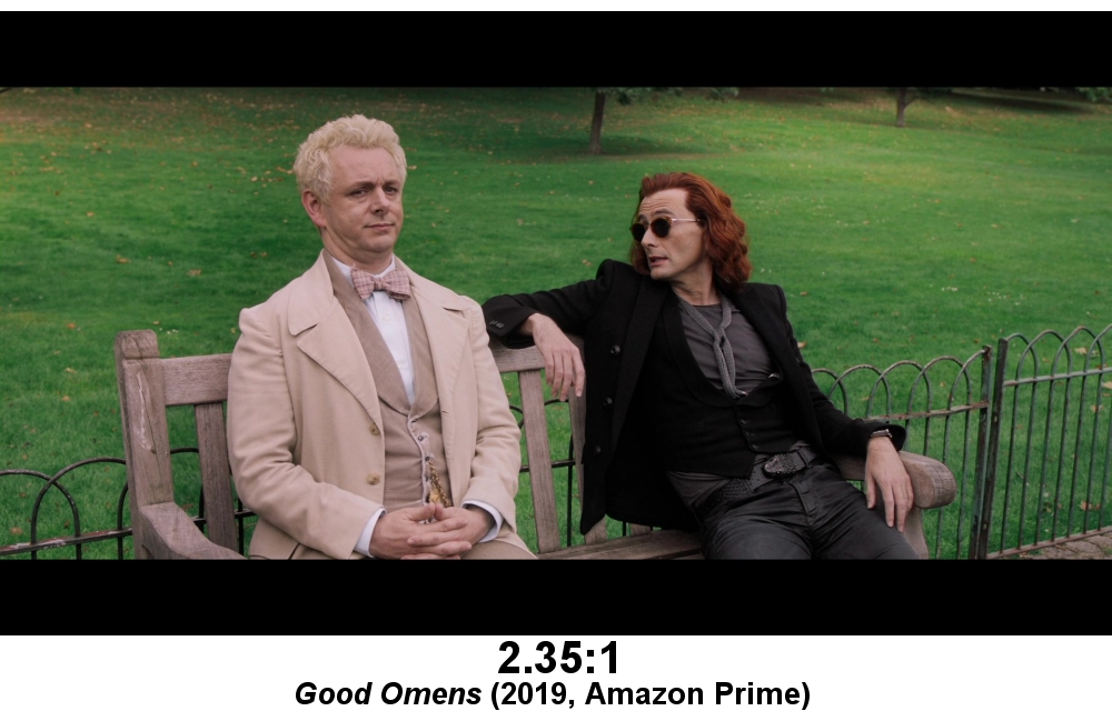
The more shows that play with wide aspect ratios, however, the more often it feels like they're used in an arbitrary fashion with little discernible purpose. At this point, well over 200 different series, across every possible programming genre, stream or air with some form of letterboxing baked into the image. Some of them seem needless at best. Nailed It! is a really fun baking competition show, but does the 1.90:1 letterboxing actually enhance it in any way? Others are simply baffling. What possible need is there for The Kasey Graves Christmas Show (Amazon) to be presented in 2.20:1 widescreen? Rather than increase viewers' involvement, that may have the opposite effect and distance them from the people on screen.
The 2K and 4K digital cameras used in the industry today have image sensors with a native aspect ratio of about 1.89:1, which may explain the trend toward series with ratios in that vicinity. Shows that are finalized for the traditional 16:9 shape typically just crop a little of the excess width off the sides, but some production houses may have have chosen not to do that anymore. On the other hand, even that would not explain shows with oddball ratios like 2.10:1, for which there was no previously established workflow in either television or feature film production. How something like that came to be is a mystery with no clear answer.
None of this is to suggest that the movement toward wide or variable aspect ratios in TV shows is necessarily a bad thing. When used with clear artistic intent, it can be very effective. Whether it's always necessary and which shows utilize it well are, of course, different questions that viewers will need to decide for themselves.
Josh Zyber has written about TV, movies, and home theater for the past two decades. Most recently, he spent more than nine years managing a daily blog at High-Def Digest.
TOPICS: Peak TV, CBS All Access, Facebook Watch, Hulu, Netflix, Prime Video, Good Omens, House of Cards, Star Wars: The Mandalorian